Software: Adobe Illustrator, Adobe Photoshop, Sketch, Adobe XD
My Personal Goals
- To facilitate a more engaging and seamless experience when it comes to Grocery Shopping
- To design a more personal and efficient user interface
- To design through user empathy (Human Centered Design or HCD)
- To design a more personal and efficient user interface
- To design through user empathy (Human Centered Design or HCD)
My goals for personal development
- Learn how to conduct and analyze user research, create flow charts, wireframes, and prototype designs through Adobe XD
- Complete a design project from start to finish while sticking to my design principles
- Complete a design project from start to finish while sticking to my design principles
The roles I assumed during the process of building this redesign
- User Researcher
- Data Analyst
- UI Designer
- Data Analyst
- UI Designer
PROJECT SUMMARY
1. User Needs
Publix is a large scale grocery franchise based in the United States, namely the Southeast. Although their customer satisfaction ratings have remained relatively constant over the last 4 years, their market share as well as revenue has been on a steady incline, however the profit margin is paper thin between Publix and their largest competitors; Winn Dixie, Target, Whole Foods, to name a few. Walmart is the only competitor that hits Publix hardest, especially when it comes to offering customers cut-rate prices. Industry Experts say the revenues and profits are driven mainly by its customer service, quality products and its value. Because Publix is employee-owned, the employees have a stake in the success and profitability of the company. Publix believes their prices are good enough to keep people coming back.
Because of this, Stakeholders wanted to add to this by making the shopping experience more pleasurable and convenient to help the consumer save time and money.
Vision Statement
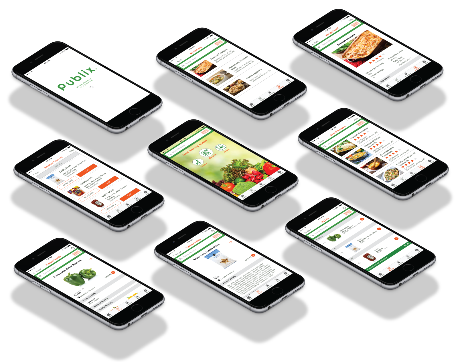
The Publix Mobile App is a grocery shopping tool that helps customers quickly and easily build a grocery list, access coupons and see prices/totals as well as search recipes and add items to their cart from the recipe box to assist in a convenient and pleasurable shopping experience once in the store.
USER RESEARCH AND DATA
Before I began my redesign project, I conducted interviews with 50 users over the age of 18 to get a better understanding of who I am designing for. What does a typical Publix App user look like? What are their reasons for using the app? What keeps them coming back? These interviews were conducted either in person or via phone calls.
Target Audience Demographics:
Among the 50 Publix Grocery App users I interviewed, there were 21 males and 29 females. The age of the male users ranged from 37 to 52 years old, while the female users ranged from 33 to 49 years old. I felt this was a fair representation of current grocery shopping statistics that reflect an increase in male shoppers over the years with 58% of shoppers being woman and most shoppers falling within the average age of 44.
I asked the following questions:
1. How do you shop for groceries?
96% Shop at supermarkets
96% Shop at supermarkets
2. How was your most recent experience?
52% Had a positive experience
30% Had a negative experience
18% N/A
52% Had a positive experience
30% Had a negative experience
18% N/A
3. What are your expectations when you visit with the intent to buy groceries?
41% Want a good price/sale or available coupons
39% Want it to be a quick and simple experience
4. Do you go to other Supermarkets?
90% Switch between supermarkets
41% Want a good price/sale or available coupons
39% Want it to be a quick and simple experience
4. Do you go to other Supermarkets?
90% Switch between supermarkets
5. If so, why?
57% Said because of price
43% Said because of product availability
57% Said because of price
43% Said because of product availability
Some additional insight based on the Food Marketing Institute report:
75% Make a grocery list prior to shopping
70% Search for coupons
42% Want a quick and simple experience
36% Create recipes/meal plans
23% Hate not finding what they are looking for
75% Make a grocery list prior to shopping
70% Search for coupons
42% Want a quick and simple experience
36% Create recipes/meal plans
23% Hate not finding what they are looking for
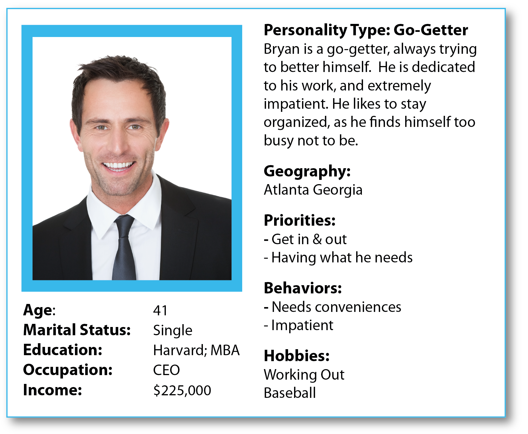
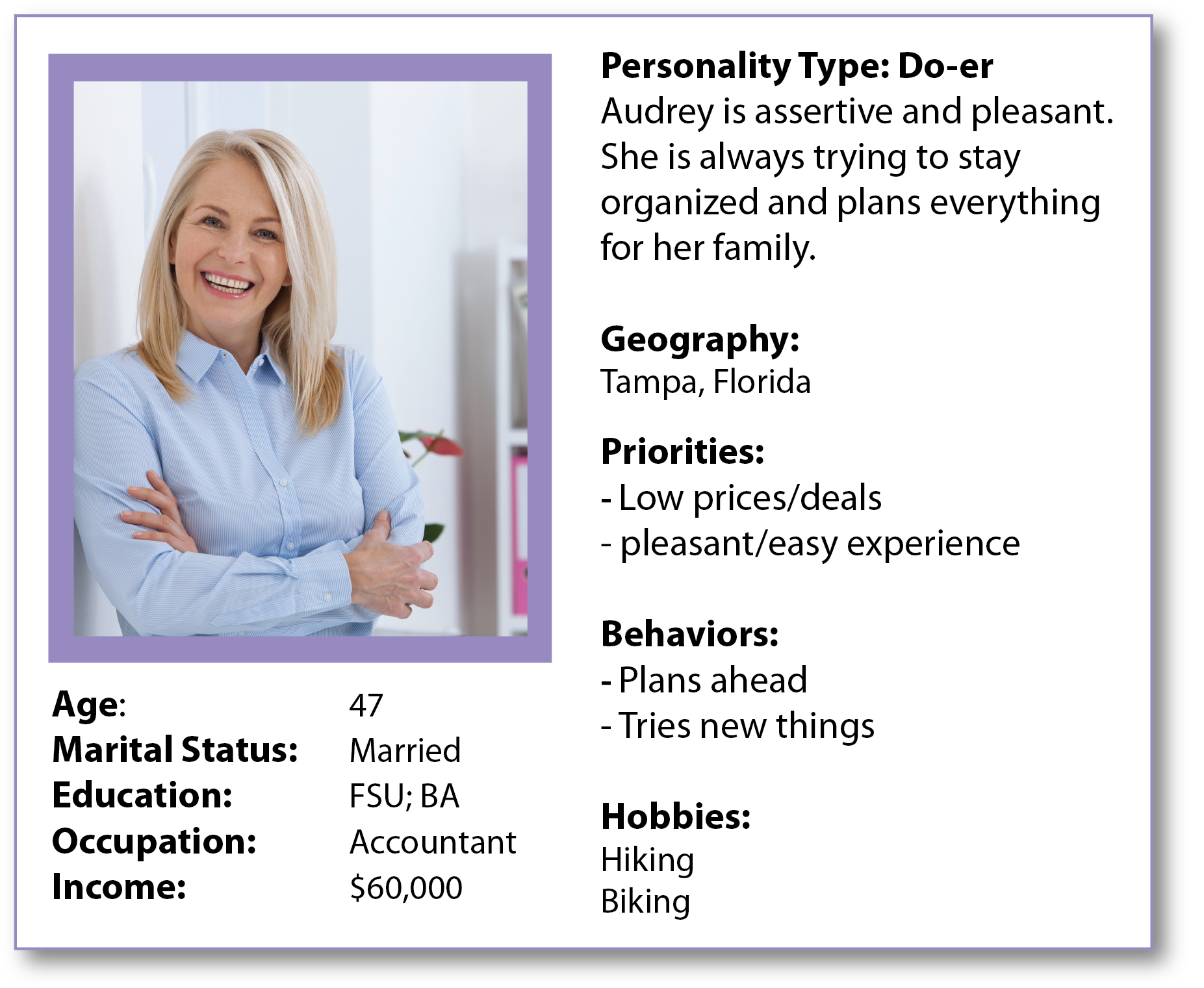
Personas
Based on my research, I created 2 personas: Bryan Bach and Audrey Gleske.
Based on my research, I created 2 personas: Bryan Bach and Audrey Gleske.
2. Brainstorming
The Problem: Most Shoppers did not know if the products were available prior to their shopping experience nor the costs. And once there, they get frustrated if they can not find products or there were no coupons or savings available to help with their budget. This would at times force them to switch supermarkets. They wanted a quick and easy experience.
The Solution: To update the Publix app to allow the shopper to quickly and easily shop, using a list builder without spending any extra time. This list builder would assist in watching their budget, as it will apply any coupons to their products in their list and showing what their estimated cost would be. The list builder will show the shopper what aisle each product is located in and in the order they are in the store that they have chosen as "their store". The shopper will also be able to search recipes and meal plans and sync these products to their List builder.
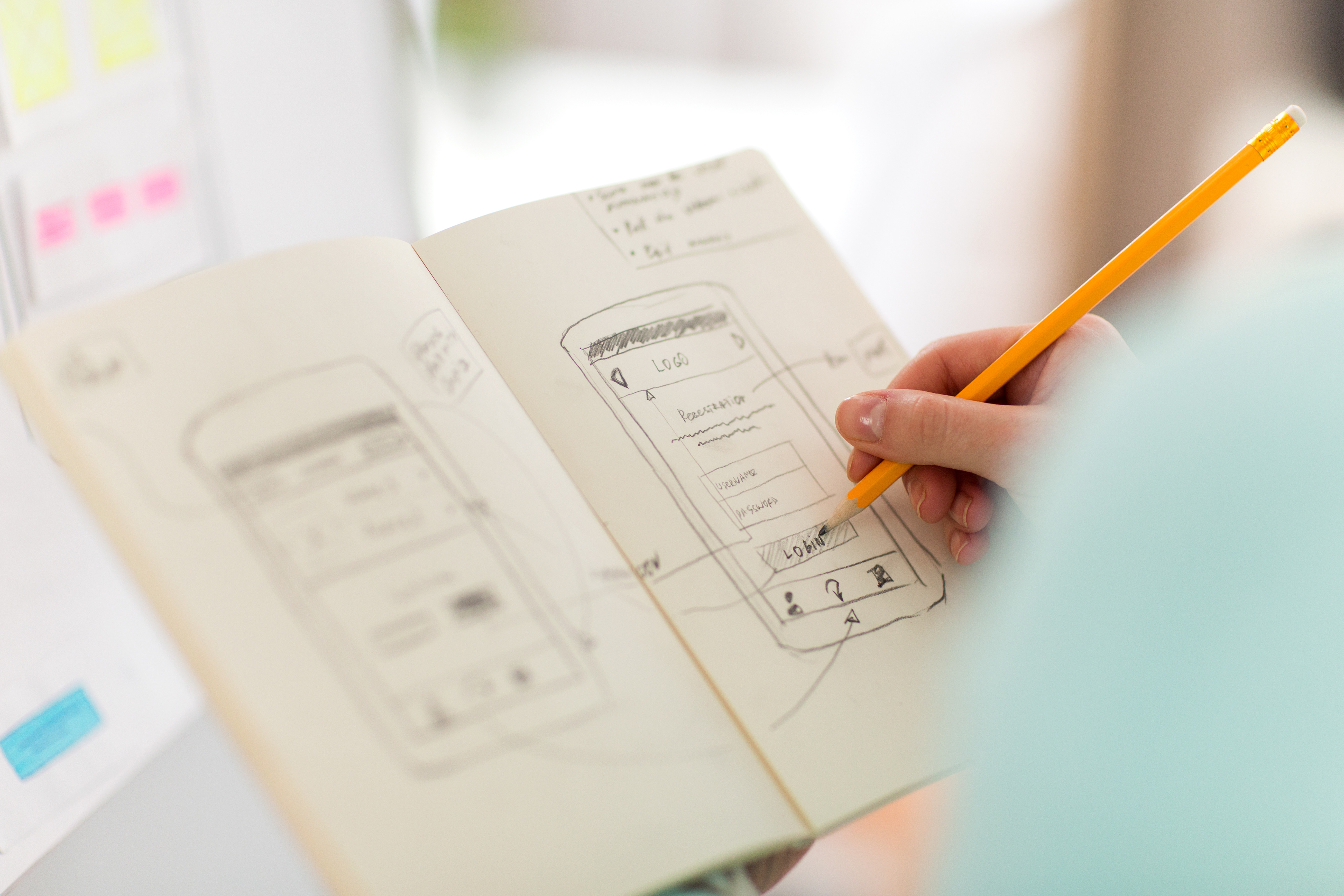
3. UX Design
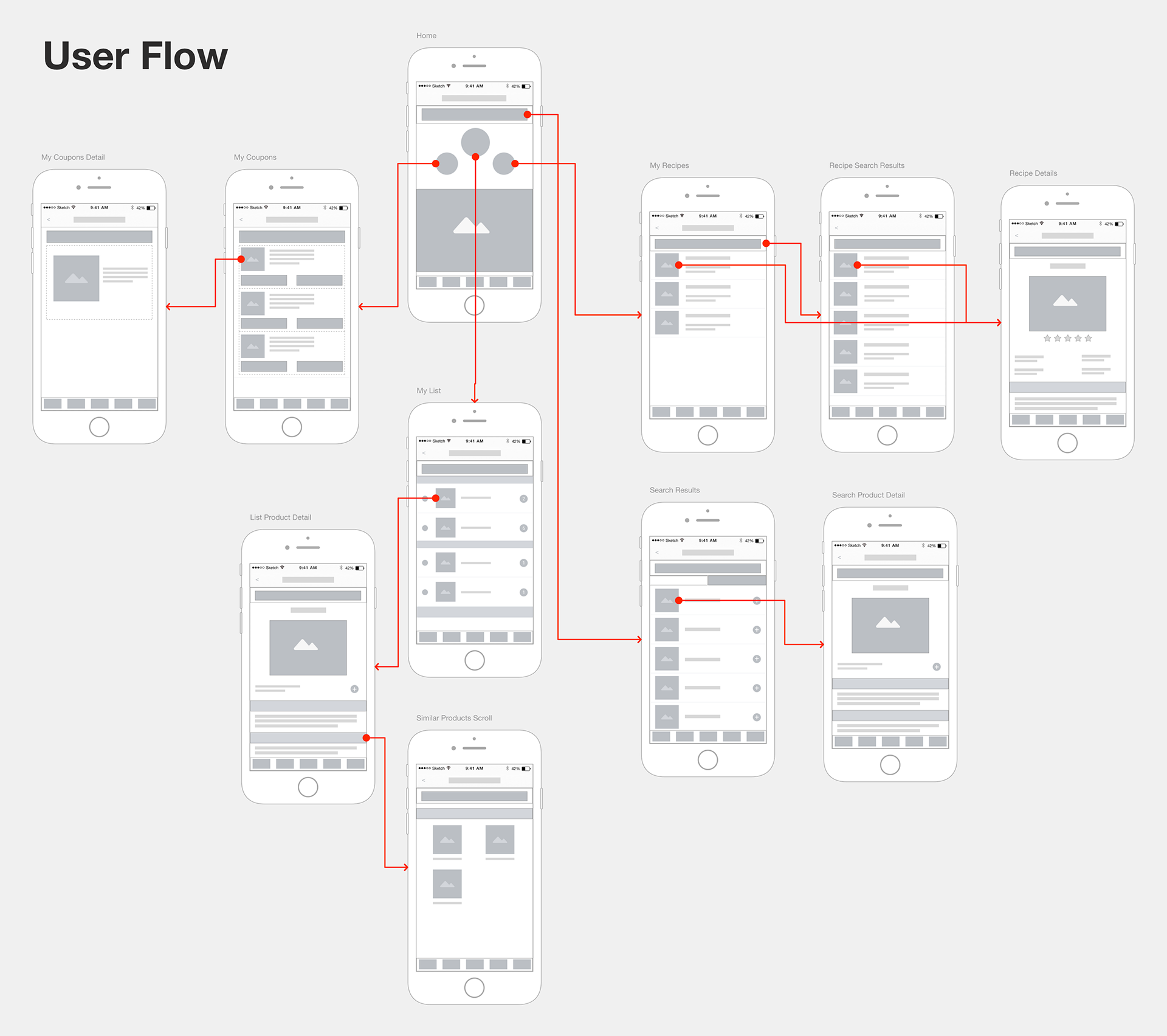
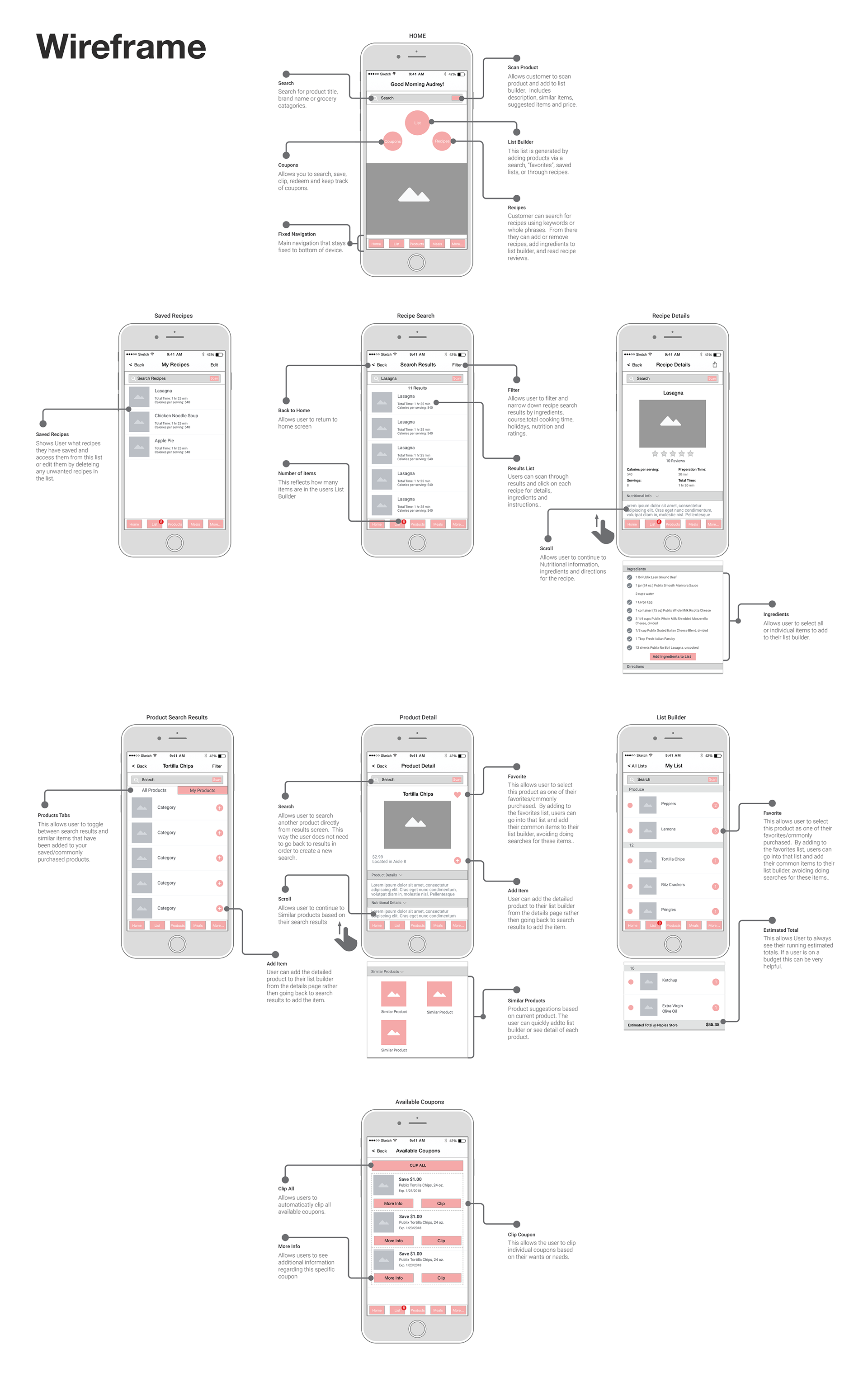
From here, I took all of the broad ideas from the brainstorming and broke them down into smaller more actionable goals. I created a user flow to determine how to complete each users goal in the least amount of steps. I broke down each user flow into a system of interconnected components. I developed wireframes based on the components and determined various states for each wireframe.
4. Visual Design
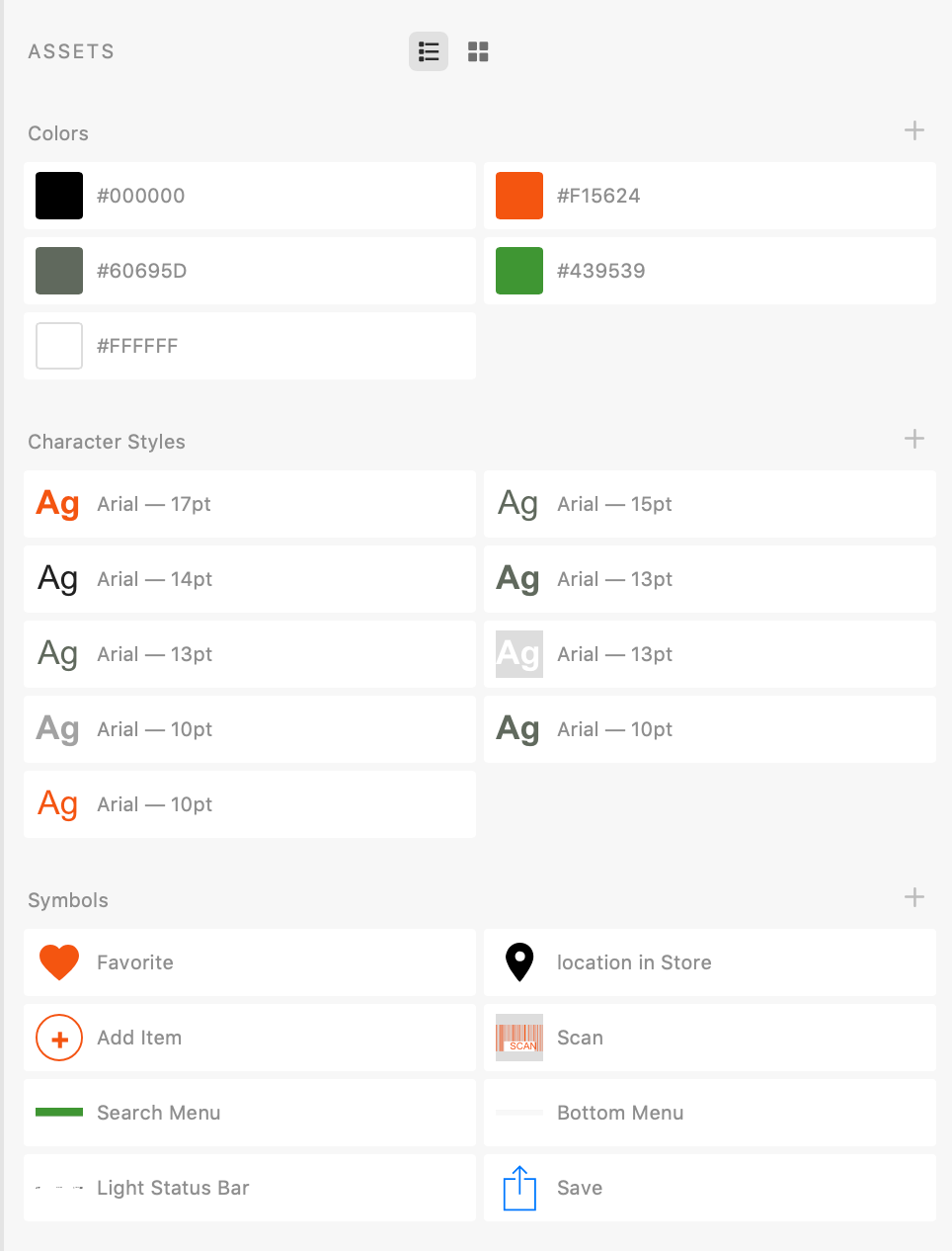
Once the User Flow and Wireframing was complete, It was time to explore visual design patterns based on Publix Style Guide. Using the UI kit and reusable components that I created I took the wireframes and created digital high fidelity mockups. Creating reusable components and style guides helps guide the engineers into understanding the visual properties in the high fidelity mockups.
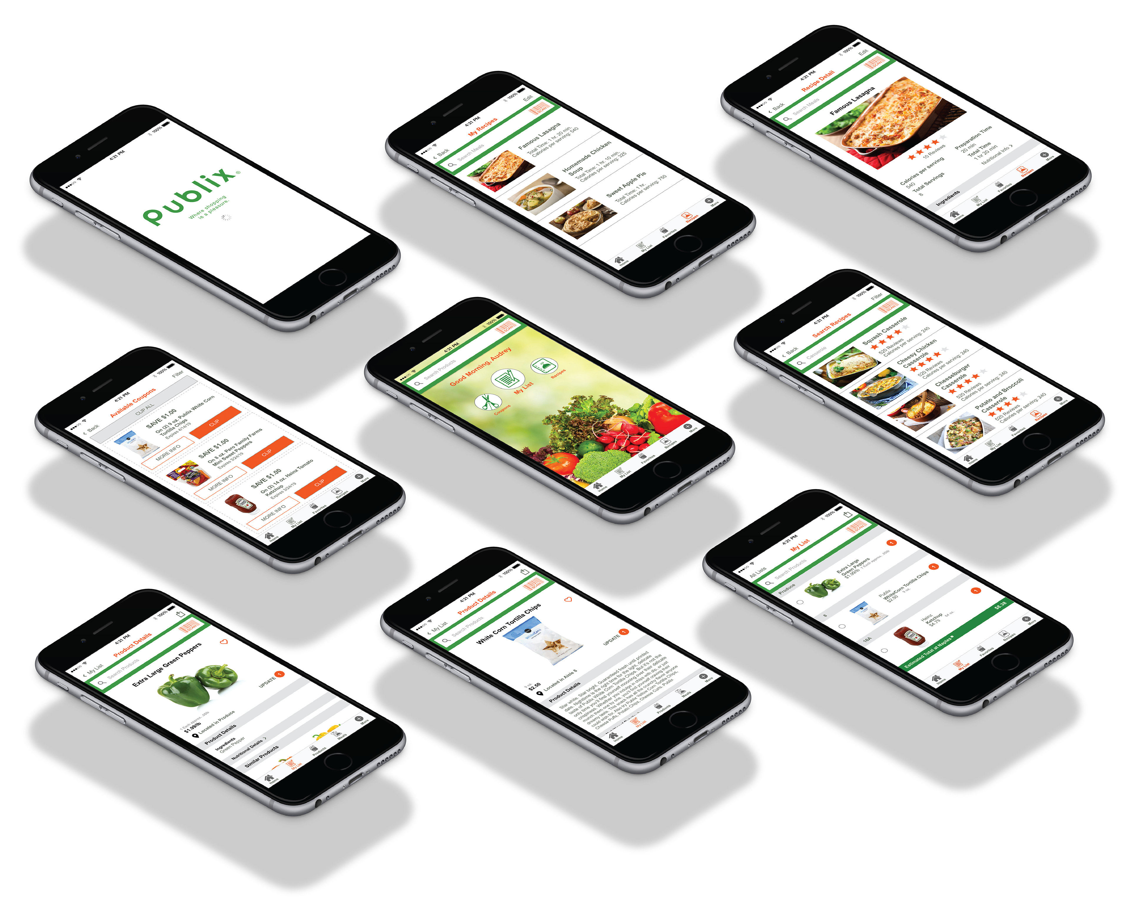
5. Prototype
I then created interactive prototypes for the client and engineers to demonstrate motion, state, context etc.
6. Testing
The Assets are now ready to be handed over to engineers. As a designer, I will collaborate with the engineers to determine any technical constraints based on the visuals and determine if the visuals are adaptable at various sizes.
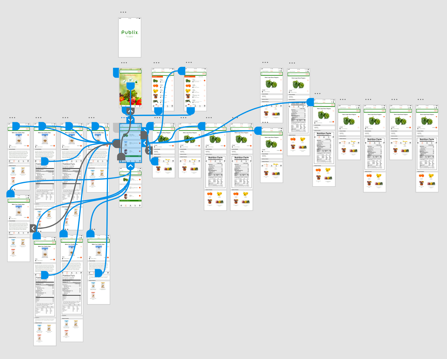
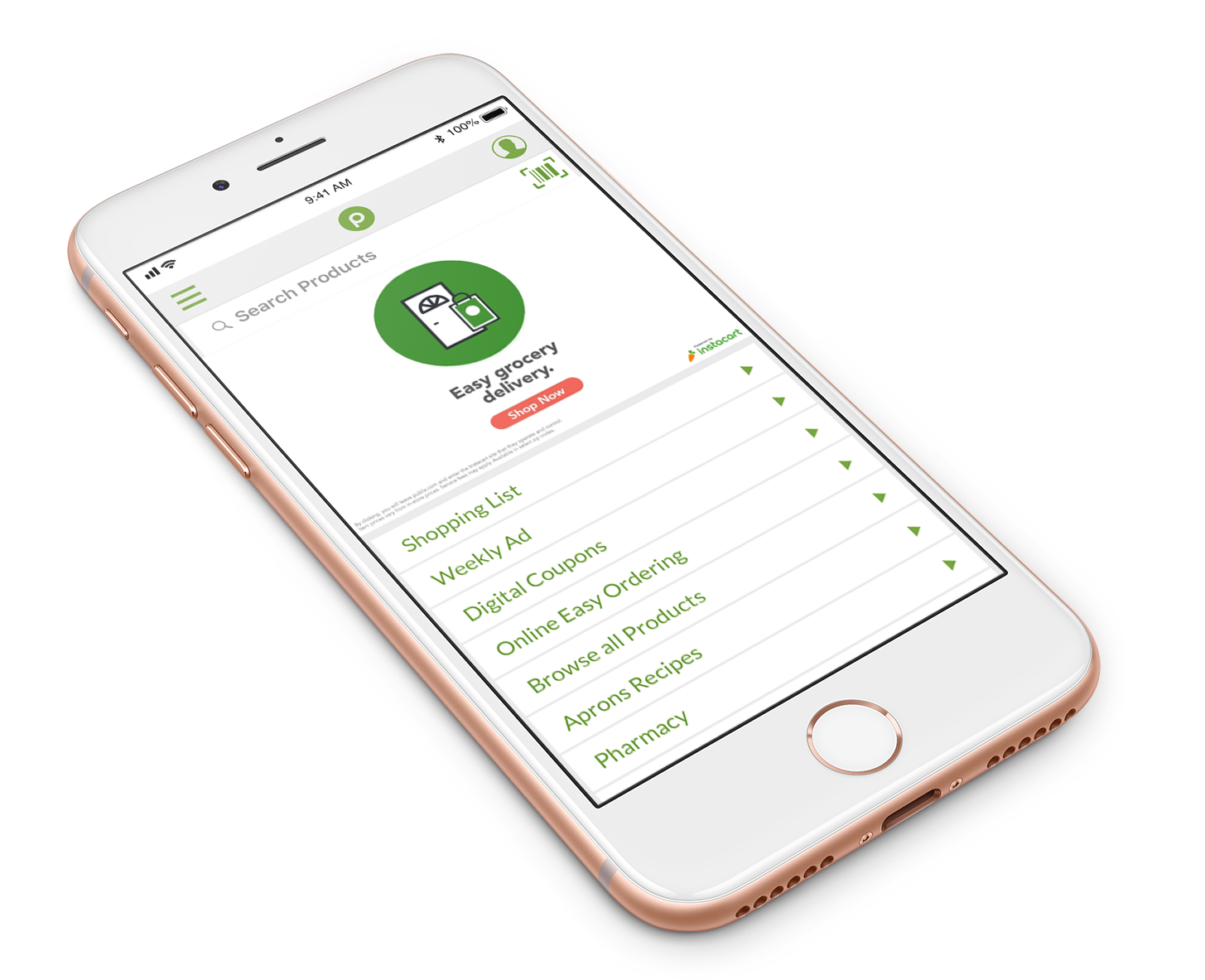
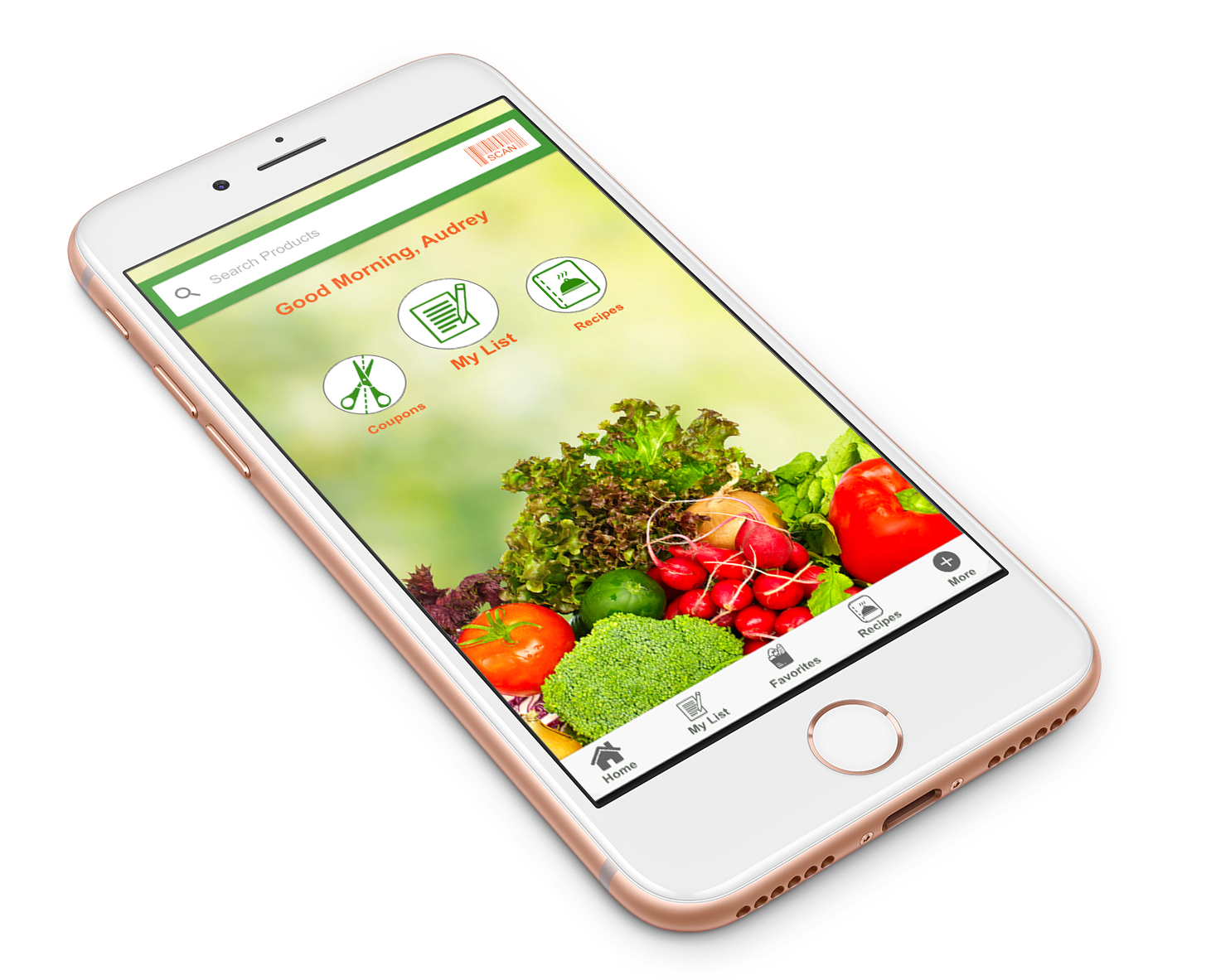
Before and After Re-design:
Home Screen BEFORE
Home Screen AFTER
My List BEFORE
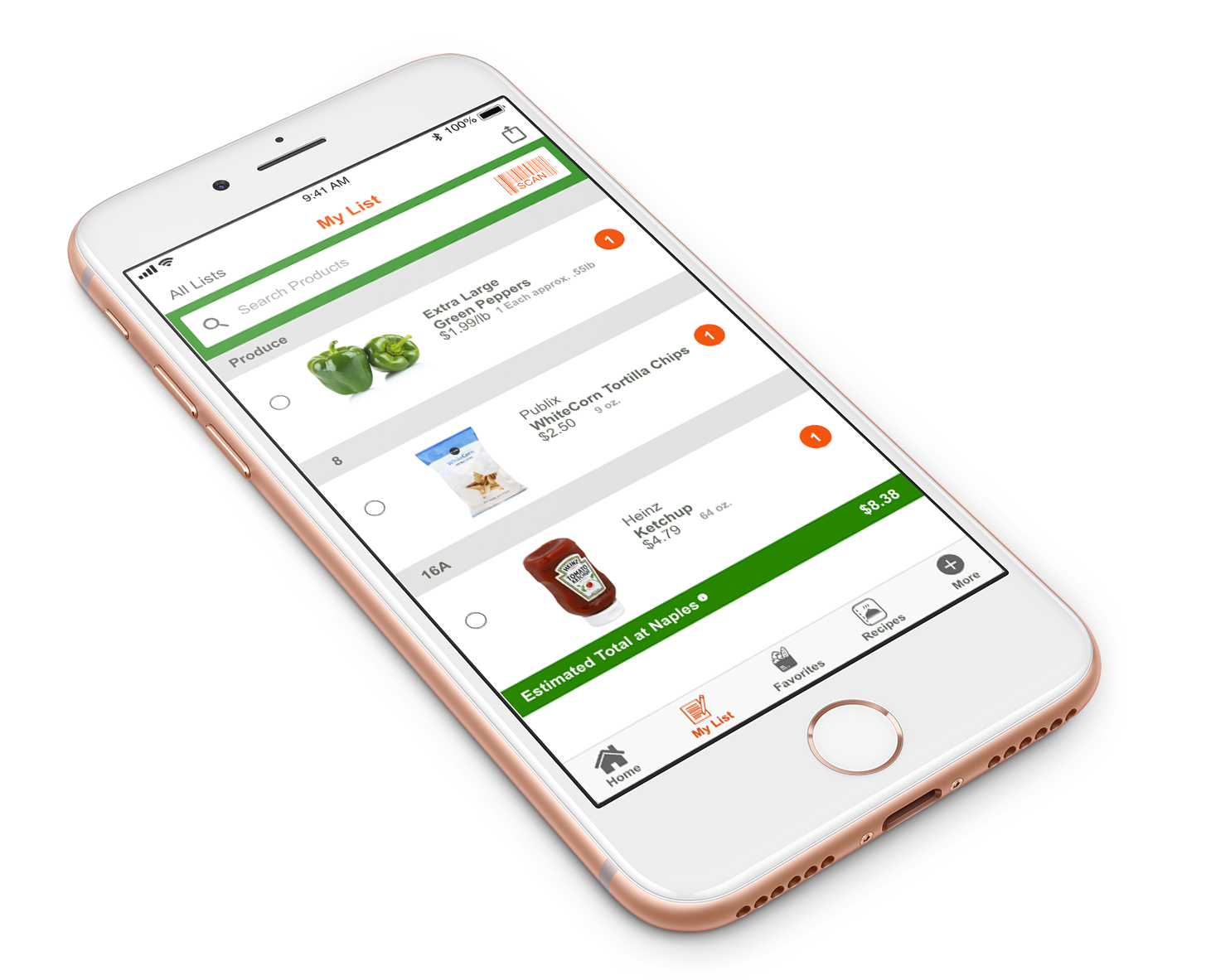
My List AFTER
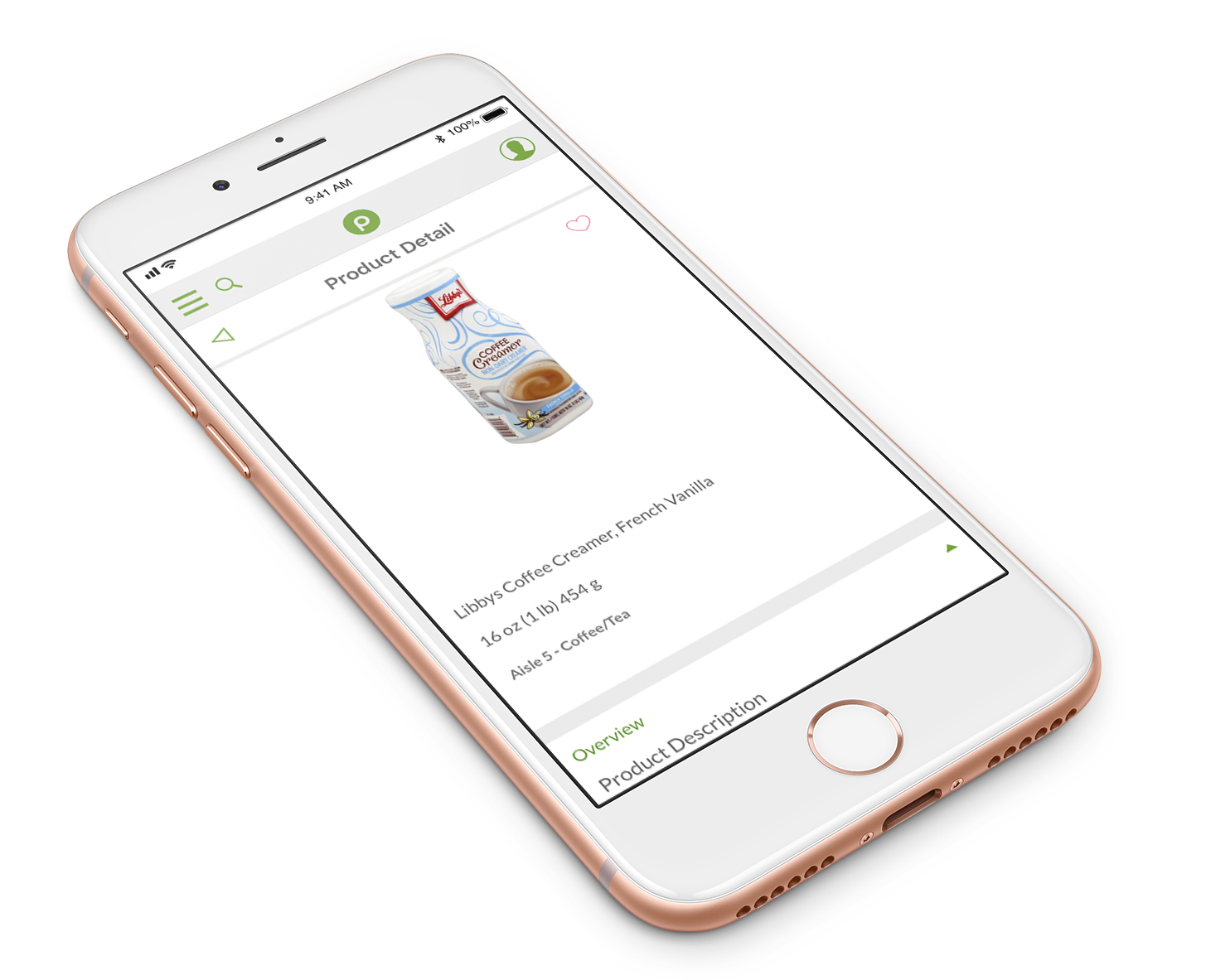
Product Detail BEFORE
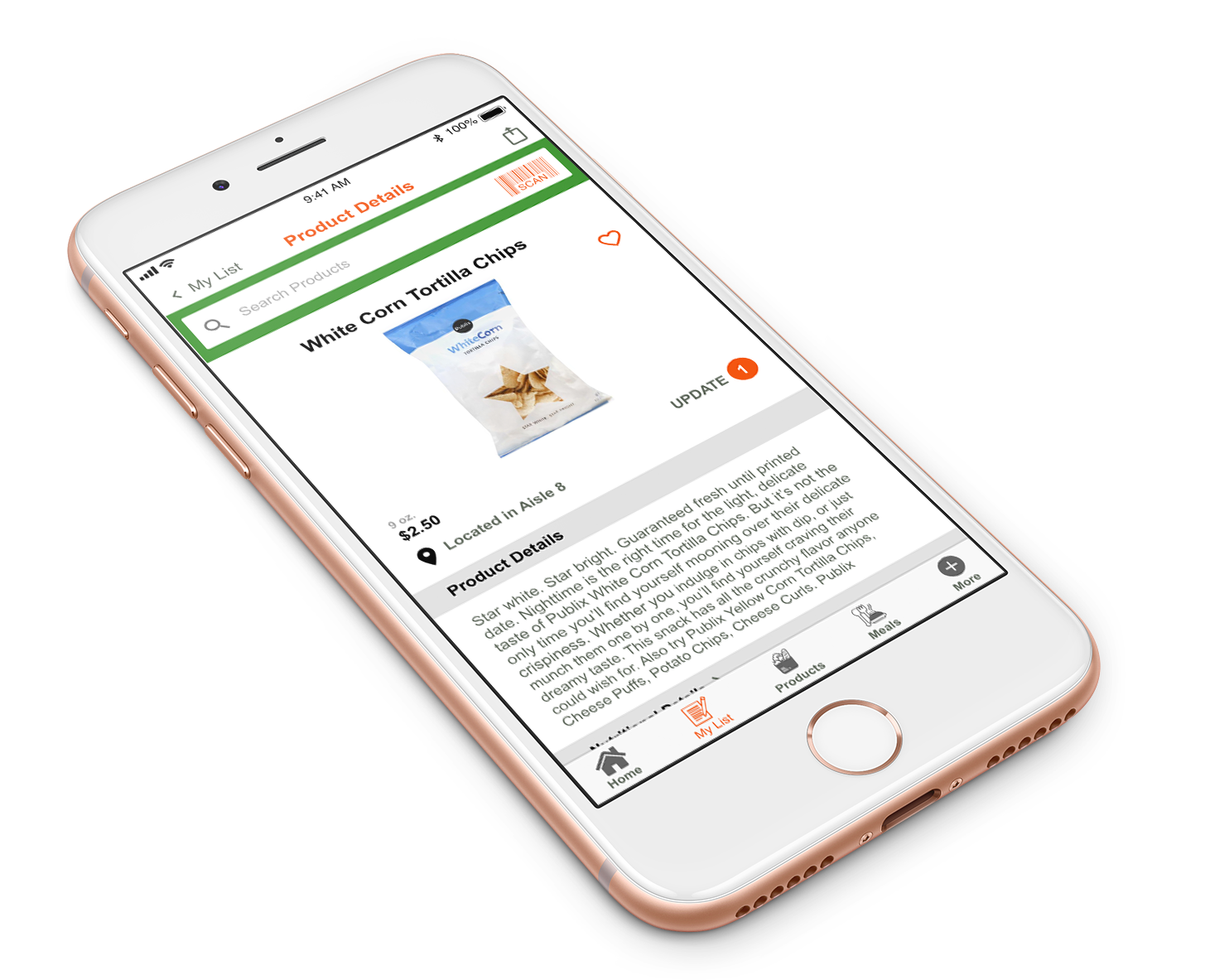
Product Detail AFTER